boldSOCKS Campaign Design
Creating a flexible campaign system for a brand built to stand out.
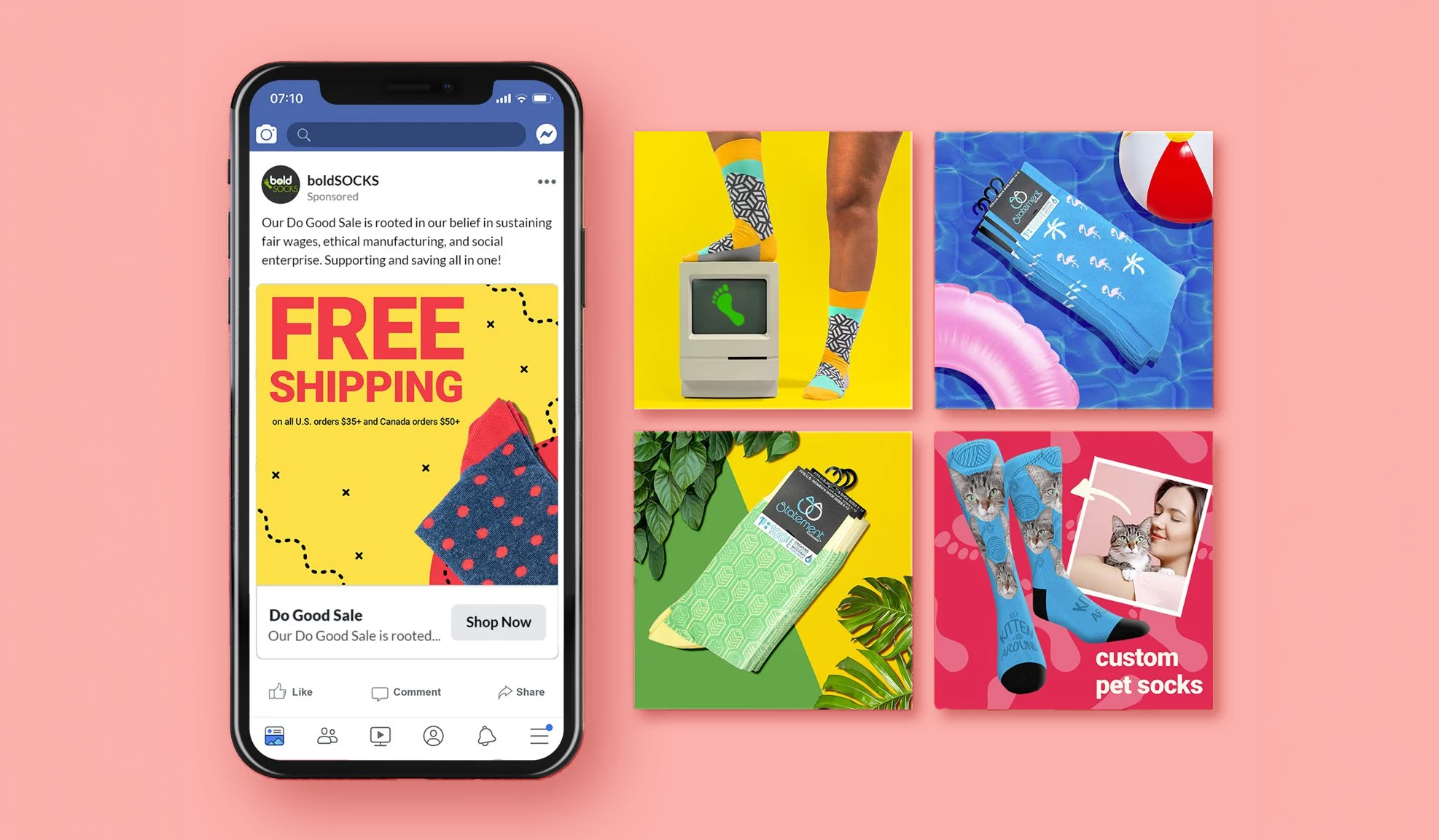
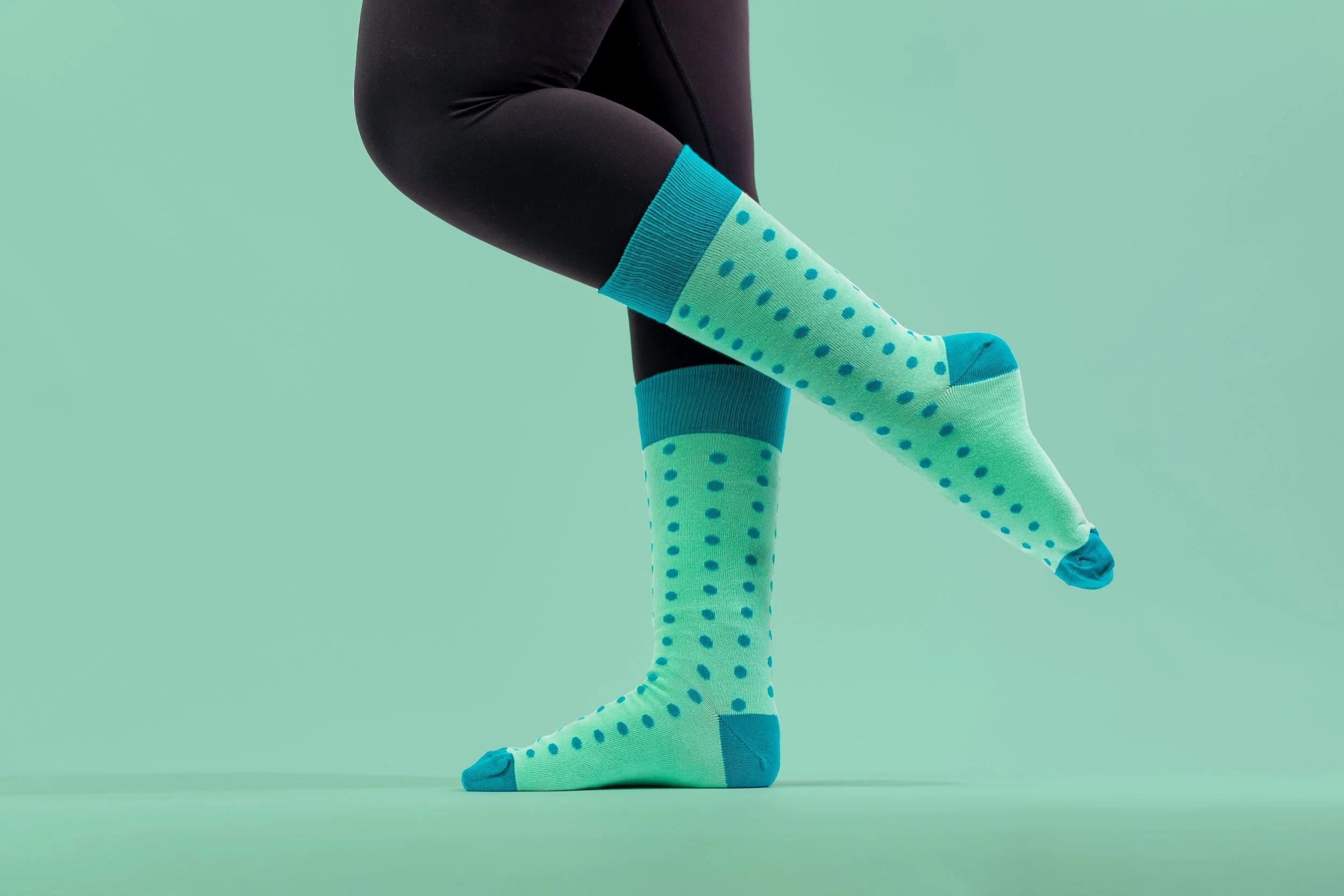
boldSOCKS needed promotional creative that could move quickly across sales, product launches, gifting campaigns, and seasonal moments without losing the brand’s distinctive personality. I refreshed the visual direction across email, advertising, and social media, combining high-impact color, expressive typography, product-focused imagery, and direct messaging into a more cohesive system.
boldSOCKS needed to communicate a wide range of offers and products while maintaining a recognizable brand presence across every campaign. Without a flexible visual structure, individual promotions risked feeling either disconnected from one another or too repetitive. The challenge was to preserve the brand’s energy while making each message, product, and call to action immediately clear.
Problem
The refreshed system introduced stronger color blocking, expressive typography, playful product compositions, and a clearer promotional hierarchy. It could adapt across long-form emails, paid advertising, product launches, and seasonal campaigns while maintaining a consistent visual identity. The result was a more cohesive brand presence with enough flexibility for every campaign to have its own personality.
Outcome
Role: Lead Graphic Designer