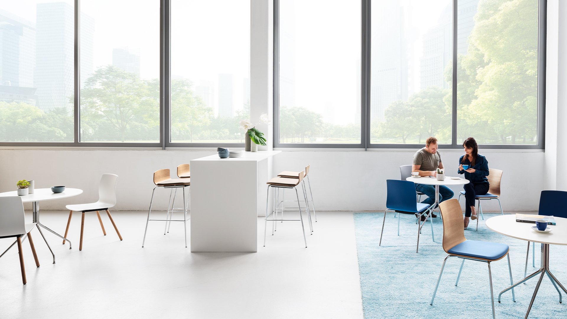
Dauphin Product Experience Redesign
Redesigning a commercial furniture company’s product experience to help sales teams find essential information faster.
Dauphin is a commercial furniture manufacturer whose product pages serve as an important resource for customers and sales representatives. I led the UX and web redesign of this experience, reorganizing specifications, variants, finishes, and model information around the questions sales representatives needed to answer during client conversations.
The redesign paired strong product imagery with a clearer information hierarchy, making each page more effective as both a sales tool and a product resource.
Sales representatives frequently relied on Dauphin’s website during client meetings, but essential information was buried within dense and cluttered product pages. Locating dimensions, finish options, and available models required too much navigation, interrupting conversations and making products more difficult to compare.
The challenge was to surface technical information faster without reducing the visual impact expected of a design-focused furniture brand.
Problem
The redesigned product pages moved essential specifications higher on the page, simplified how variants were presented, and created clearer relationships between product imagery, model lines, and finish options.
A more focused hierarchy allowed sales representatives to move through products more efficiently and keep client conversations centered on decisions rather than navigation. The resulting experience gave Dauphin a stronger digital sales tool while creating a more consistent way for every visitor to understand its product range.
Outcome
Role: Lead Graphic Designer